


If you believe in Strokes Gained, you must believe in EPA
Let's be smarter football fans this season, and forever

There's a common, and correct, assessment that golf usually lags behind other sports in terms of innovation. However, both fans' embrace and broadcasts' employment of the preeminent outcomes-based statistic for the game, Strokes Gained, is years ahead of America's biggest sport, football, which has an identical statistic, Expected Points Added, commonly referred to as EPA.
It's past time that football caught up. Sadly, I've lost faith that this will happen throughout football via a top-down approach where broadcasts and pundits propagate EPA into fans’ lexicons. There’s too much vitriol from the talking heads toward anything related to analytics, even though EPA is anything but voodoo magic once you understand it. To see any change, we'll need a grassroots campaign instead.
So I’m calling on golf fans everywhere: let’s lead the charge on the EPA revolution within football and show the world that golf isn’t so archaic. We already champion Strokes Gained. You don’t need to make any additional leaps to understand EPA’s nature; it’s calculated in the exact manner as Strokes Gained. We must promote EPA similarly as the preeminent tool for analyzing performances and then, hopefully, the rest of the world will join.
Strokes Gained
By now essentially all golf fans, regardless of their seriousness, have encountered the Strokes Gained statistic. It may have been through a broadcast’s graphics or commentary, a Golf Channel show, or somewhere online. The statistic has become, rightfully, the leading method to judge a professional golfer’s skill, which is why it is mentioned so often. Its methodology is brilliant and foolproof.
Strokes Gained is calculated by comparing the average, or expected, number of strokes needed to get the ball into hole from the starting position of a shot to the average number of strokes needed to get the ball into hole from the position of the ball after that shot. The difference between those values produces the metric.
The expected number of strokes to get the ball into the hole from any position is calculated using the average historical outcome from that exact position in terms of distance to the hole and lie.
Strokes Gained was made possible via the PGA TOUR’s ShotLink technology which tracks the position and lie of every single shot. Strokes Gained required the advent of this new data to compute the averages. Mark Broadie was the first to complete this calculation and subsequently pioneered the concept of Strokes Gained.
Here's Broadie explaining how his stat applies to putting in his foundational book,
The key idea in strokes gained putting is to measure putt outcomes against a performance benchmark based on putt distance. The benchmark for pros is the PGA Tour average number of putts to hole out from a given distance. For example, the tour average from 33 feet is two putts. A one-putt from 33 feet gains one stroke compared to the tour average. A two-putt from 33 feet gains zero compared to the tour average. A three-putt from 33 feet loses one strokes compared to the tour avers. Strokes gained putting for pros, then, is the tour average number of putts to hole out from a given distance minus the number of putts taken.
This example uses simple round numbers, however Strokes Gained values are typically fractional. Every single shot, regardless of circumstance, can be assigned an average number of strokes to hole out. For example, as outlined by Broadie as well, a given pro golfer might be tested with an eight-foot putt, which on average takes 1.5 strokes to hole out. If the player makes that putt they would gain 0.5 strokes, since they only used 1 stroke when average player would use 1.5.
If you prefer a visual explainer of Strokes Gained: here you go.
The inherent beauty of Strokes Gained was that it could be calculated anywhere from individual shots all the way up to entire careers and, because its baseline is historical outcomes, there is no debating the validity of its values. This objectivity is part of the reason why so many people reference Strokes Gained nowadays.
Not only does Strokes Gained provide a complete and objective account of player performance, but it also solves many other challenges that prior statistics did not effectively address.
First, Strokes Gained can be, and typically is, normalized on a per-stroke basis. A player that plays more rounds over a season may have a lower cumulative score to par, more top-ten finishes, and make more money than their counterpart, but they may not be the better player. By accounting for the differences in total strokes taken, Strokes Gained easily discerns which players are better on a per-shot basis.
Second, Strokes Gained allows for the breakdown of different skill elements. Prior to Strokes Gained, a given statistic could not easily measure the performance of each individual shot in comparison to all others. Putts could not be easily compared to fairway bunker shots in numerical terms, for example. There were ball-striking statistics, putting statistics, and overall statistics. These could be used in conjunction to form an understanding of a golfer’s strengths and weaknesses, but not compared directly to each other. Strokes Gained measures every facet of the game equivalently.
If you analyze an entire round of golf, you can calculate a player’s Strokes Gained: Overall, but you could also just analyze their tee shots or putts to gain an understanding of their Strokes Gained: Off the Tee or Strokes Gained: Putting, respectively. You can compare any shot or set of shots to any other, precisely. We know that driving it in the rough is worse than driving it in the fairway, but how much worse? Strokes Gained tells you with a definitive number. Good shots gain strokes and bad shots lose them. People always comprehended this, which makes Strokes Gained intuitive. Now there’s a quantitative value to go along with the qualitative assessment.
Finally and critically, Strokes Gained allows for easy and effective rankings of players. The player with the higher Strokes Gained value over some period is the better player for that period. Most often, players are be ranked via Strokes Gained: Overall, or by any of the subcategories (Putting, Around the Green, Approach, Off the Tee), but you can use any criteria you want and Strokes Gained will deliver. We can easily tell how everyone is performing relative to their peers at any granularity using Strokes Gained, such as who performs best on Pete Dye courses.
Ranking players using Strokes Gained also eliminates some of the issues of other ranking systems like the Official World Golf Rankings (OWGR)1. The OWGR is the most used and most important ranking system for professional golfers. It awards points to golfers based on their tournament finish positions, such as 1st or t-34th. The OWGR then ranks the players according to their average points awarded per tournament from the past two years, with more weight applied to the recent events. The downside to a system based on tournament finishes is that runaway performances are not properly accounted for. The fundamental issue which plagues the OWGR is that all players winning an event will receive (roughly) the same number of points. A player could win by 10 strokes or 1 stroke and they will receive the same amount of points from the OWGR. Part of Tiger Woods’ dominance was not just that he won, but that he won by a lot. This is not accounted for in a finish position-based ranking system like the OWGR, but is accounted for through an outcomes-based ranking system like Strokes Gained.
As a corollary, inconsistent success is also not properly classified by the OWGR. Soly and Jon Rahm discuss this phenomenon on a No Laying Up episode (36:45 mark).
While I don’t know the specifics, a player finishing in 12th place in five straight events may receive the same total amount of OWGR points as a player with four missed cuts and one win in those same events due to the asymmetric points allocation for top finishes. Intuitively, this does not feel correct. The consistent high-quality performances of the first player should be rewarded more. Strokes Gained accounts for this as all strokes are weighted equally and the average performance of the lightning-in-a-bottle player is worse than Mr. Consistency.
Similarly, the OWGR awards zero points when a player misses a cut, but that is a broad label for the performance as the player could have missed the cut by one or been in last place. Strokes Gained captures the complete picture of a given performance and should therefore be used to rank the players.
I must shoutout Data Golf because they’ve developed their DG Rankings system using a Strokes Gained-based approach. I believe the DG Rankings reflect the proper rankings of professional golfers more than the OWGR because their methodology is more optimal since it relies on Strokes Gained. They also produce wonderful data visualizations related to Strokes Gained such as their interactive player profile pages.
Though it took time to get here, Golf broadcasts and pre-tournament panels will now discuss the Strokes Gained elements of different players’ games. When mainstream sources of information, like these shows, discuss Strokes Gained it normalizes the previously foreign concept for casual fans. Analyzing performances through a Strokes Gained perspective is the proper way to highlight variance in skill so touching on it in broadcasts assists all viewers. By embracing rather than shying away from helpful advanced statistics, fans become informed on what truly matters when they tune in.
I’ve been pleased with this development in golf and would love to see something similar happen with Football and Expected Points Added, but I don’t think it’s going to. Getting EPA into the mainstream consciousness will require a ground-up approach. One that golf fans, with Strokes Gained already in their back pocket, can lead.
Expected Points Added
Michigan Football Analytics Society explains,
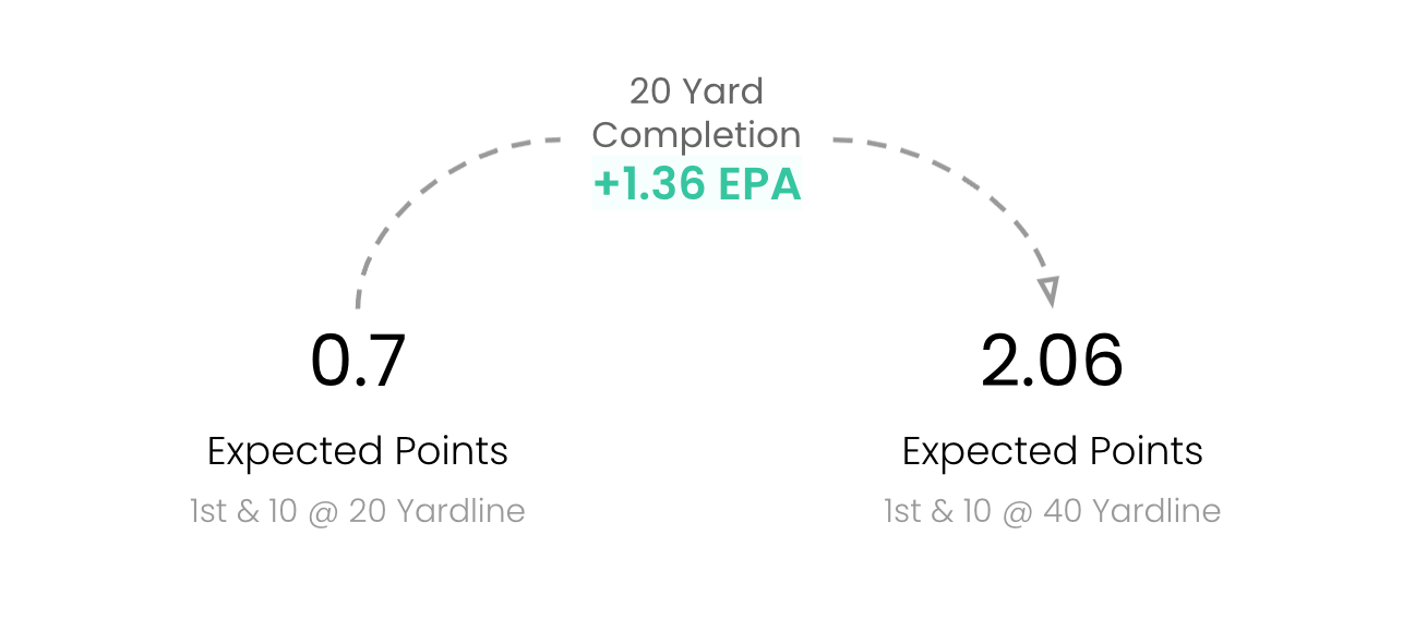
Expected Points Added (EPA) is the most commonly referenced statistic in football analytics circles. The stat is based on Expected Points, which measures how many points a team, on average, is expected to score on a possession given a particular field position. A possession’s Expected Points may range from close to 7, which would occur in a situation like 1st and Goal at the 1 yard line where a team is very likely to score a TD, to negative numbers where the defending team is the most likely team to score next, which would occur when a team is backed up deep in their own territory. EPA measures the change in Expected Points that occurs on each play. The great thing about EPA is that it accounts for the fact that not all yards have equal value. A 5-yard gain on 4th and Goal at the 5 is very different from a 5-yard gain on 3rd and 20. EPA captures this and has become the leading way to quantify a team’s offensive and defensive efficiency.
Strokes Gained and EPA are almost identical! They involve the same calculation, just in different contexts. Therefore, EPA also provides all the same benefits as Strokes Gained and solves for the shortcomings of other more common football statistics.
Similar to how Strokes Gained is typically normalized on a per-shot basis, EPA is typically normalized on a per-play basis. In this manner, EPA allows for easy comparison.
EPA also quantifies the different elements of the game. A team’s offense has an EPA/Play and a team’s defense has an EPA/Play Allowed. You can also analyze more selective situations, such as strictly third-down performance or passing plays.
Finally, just like Strokes Gained, EPA accounts for more dominant versions of the same game result. There is a difference in winning by one versus winning by ten, even though both teams achieve the same record. This is reflected in a team’s EPA/Play.
This also means that flukier, one-off performances are not overweighted when determining who the best teams are. One upset win is often the result of costly turnovers by the favored team or explosive plays by the underdog team. Though a win was achieved by the underdog, their EPA/Play was probably not very high. Think about the 2022 Minnesota Vikings. Their record was exceptional (13-4), but nearly all of their wins had small margins of victory while their losses were often blowouts. When it was all said and done, they sat squarely in the middle of the league for both offensive and defensive EPA/Play. This is a must more honest assessment of their competency than what their record reflected.
Let’s survey the current NFL landscape using EPA heading into Week 8 of 2024:

All of the teams’ positions on this chart align with what we see on the field! The teams poised to win the Super Bowl this year are bunched in the upper-right portion of this chart. Instinctively, all football fans know what plays have positive and negative EPA. They are the plays we cheer for, or dread. EPA simply assigns a numerical value to these results. EPA delivers precision in what was previously a murkier eye-test based world. These charts make comparing teams to each other in terms of offensive and defensive performance straightforward and objective.
In the same vain that I shouted out Data Golf, here I must shout out Ben Baldwin. He is probably the best Twitter/X follow for straightforward data visualizations involving EPA. He tweets out the chart above weekly along with other charts explaining teams’ performances on the season sourced heavily from EPA-based metrics. These threads are essential to understanding how teams are performing. Additionally, he runs a website called RSDBM.com where you can create your own EPA-based visualizations with a variety of filtering options.
Ranking football teams has always seemed difficult. With the plethora of different statistics and arguments to choose from it can be hard to come to a consensus on who the best teams are at any point, but it doesn’t need to be that way. Just use EPA. By using EPA, we can easily digest which teams are performing best overall, on offense and on defense. Kevin Cole has a Power Rankings system built using (opponent-adjusted) EPA. This methodology is comparable to the DG Rankings and I trust it way more than any of the junky Power Rankings you commonly find elsewhere.
Sadly, unlike in golf, football has shied away from embracing EPA. Compared to golf fans with Strokes Gained, football fans are much less likely to have ever encountered EPA, let alone know what it stands for.
As I said above, the embrace of Strokes Gained was driven in part by golf broadcasts embedding the statistic in their product increasingly over the past five years. I have lost hope that NFL broadcasts will ever do such a service to their fans. Less informative metrics like completion percentage or narratives like “establishing the run” still drive most NFL discussions, especially on television productions. These talking points lack substance when compared to EPA. NFL broadcasts owe it to their viewers to discuss how teams are performing using EPA, especially since it can be sliced and diced in so many different ways. This will in turn reduce the barrier for casual fans to embrace EPA, but I’ve lost faith that it will ever happen because analytics is often denigrated on NFL productions. Here’s the rap “football analytics” tends to get. This is frustrating because EPA is grounded in reality. It's literally based on what's historically happened.
A package like the following related to EPA would never appear during an NFL game, except for maybe Sunday Night Football.
It’s unfortunate that EPA gets limited to analytics-focused discussions instead of reaching mainstream audiences. It is the statistic to understand football performances and should be the first point discussed in any debate. Just like Strokes Gained, EPA is the signal amidst the noise.
If you, the reader, were hesitant to embrace EPA prior to reading this hopefully you have gotten over that hump now. Being knowledgeable about EPA doesn’t make you a football nerd, even though it may feel that way right now. Once you understand the definition of EPA and what it conveys, there's no turning back.
Golf fans — it’s now time to enlighten the rest of the world.
Thanks for reading.
There are many heavily contested elements regarding the structure of this system particularly as it relates to LIV GOLF, which I won’t touch on.